Progress indicators are everywhere. They show up on your phone when you refresh a data feed, on your computer when you download a file, on your TV when Netflix buffers that stream of Better Call Saul. They spin to remind us that something is happening, as a whispered plea not to give up on the system.
The Nielsen Norman Group laid out the fundamental UX principles of progress indicators years ago–when to use them, which flavor is right for a given scenario, and the consequences of not using them. A more recent article from Nielsen Norman by Katie Sherwin tied the importance of progress indicators to the reduction of user uncertainty and a reduction of the perception of time, and since then other UX articles have extended those findings and proposed new design strategies.
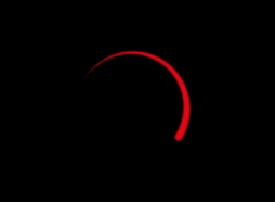
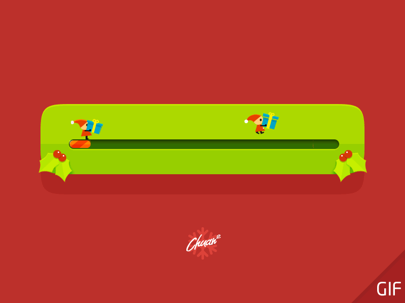
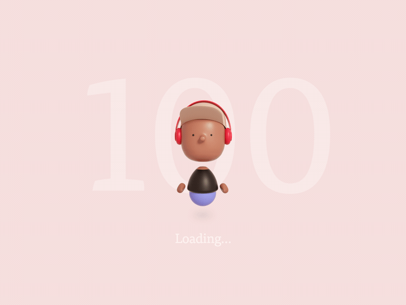
Whether they are designed with whimsy and flair (see below) or supply an exact time estimate for completion, progress indicators rarely make a user feel excited to stick around. More frequently they elicit feelings of frustration, boredom and impatience. They signal a disruption in our task, and more importantly, in the flow of precious dopamine to our brains.
For users who have disabilities, however, the frustration is worse. No progress indicator is accessible by default, and designers and developers often do not take into account users with visual impairments or visually-induced vestibular disorders.
Users with low vision may not detect a progress indicator that is too subtle or blends too well into its surroundings. For example, a visual indicator with poor contrast, like the hot pink mess below, is completely unreadable for users with impaired vision. And the Chrome mobile loading indicator, also below, blends so well into its surroundings that it is effectively invisible. In the first case, the designer decided to subordinate the valuable information within the indicator in favor of the entertaining sequence of cartoon heads. This is a risky decision: if the wait is long, a visually impaired user will be left without any practical idea of the system state, and he or she may end up resenting the colorful caricatures and their mocking faces. In the case of the Chrome loader, the intent is not to draw visual attention away from the search content; this is arguably a good practice until the visually impaired user hits a connection latency and has to wait for an error message to know how to proceed.
If a progress indicator is not accessible to screen readers, then users who are blind have to wait patiently in silence for an unspecified amount of time. Imagine not having control and not knowing what to expect; it’s like standing in the non-Fast Pass line at Disneyland without any time estimate. For these users an accessible progress indicator comes down to the markup. Progress must be expressed verbally rather than visually, and the experience must update the user frequently enough to reduce anxiety but not so frequently that it becomes unbearably annoying.
Lastly but not leastly, there are users for whom a poorly-planned wait experience can mean feeling sick and dizzy the rest of the day. People with conditions such as vestibular neuritis, Meniere’s disease, benign paroxysmal positional vertigo or migraines experience bouts of vertigo that may be triggered by visual stimuli–such as zooming, parallax, or spinning movement.
Shortly after the release of iOS 7, Apple faced an amazing backlash from its users. This update introduced new animations to the operating system: zooming into and out of apps when they opened and closed as well as 2- and 3-dimensional parallax effects with the background. Immediately there were complaints. Users complained that the animations were making them dizzy and nauseated. Over a month the Apple support thread for iOS 7 motion sickness garnered over 600 replies and nearly 56,000 views, and one of the affected users posted a petition:
I suffer from motion sickness, but usually only when I look at my phone in a vehicle. But with iOS 7 I’m experiencing nausea, dizziness, migraines, and fatigue just using it inside or on the street.
Sam Callica, Change.org petition
Within weeks Apple responded with an update, iOS 7.0.3, that included the new Reduce Motion setting. This setting not only eliminates animations within the operating system but also targets CSS animations on websites. Unfortunately for Sam and other users with visually-triggered vestibular disorders, the Reduce Motion setting does nothing if the website or app developer has not included markup to listen for it. So that spinning, zooming and parallax-ing progress indicator you just launched? It’s making someone sick right now.

All of this to say that if your progress indicators are poorly designed–in other words, not inclusively designed–you may be driving your users away. In the next two articles we will look at the different types of progress indicators within iOS, when to use each one, and how to make them accessible.
Next article (Part 2 of 3) : Indeterminate progress indicators (spinners)
References
– A New iOS Update Means Your Phone Won’t Make You Throw Up Anymore
Long time supporter, and thought I’d drop a comment.
Your wordpress site is very sleek – hope you don’t mind me asking what theme you’re using?
(and don’t mind if I steal it? :P)
I just launched my site –also built in wordpress like yours– but
the theme slows (!) the site down quite a bit.
In case you have a minute, you can find it by searching for “royal cbd” on Google (would appreciate any feedback)
– it’s still in the works.
Keep up the good work– and hope you all take care of yourself during the coronavirus scare!
Thanks for your input, Justin. The theme is “Blog Diary”. I also offer accessibility remediation services, so if you like I can take a look at the royalcbd.com website sometime and see if I can help you out.
Excellent blog you have here.. It’s hard to find high-quality writing
like yours nowadays. I truly appreciate individuals like you!
Take care!!
All I can say is perfect