In the previous article I covered progress indicators in general: their purpose, why they can be frustrating, and how users with disabilities may be particularly affected. Part 2 covers simple indeterminate indicators (spinners that do not specify the duration of a delay) and how to implement them accessibly within the iOS environment.
According to Jakob Nielsen’s book Usability Engineering, the maximum acceptable amount of time to make a user wait for a response from an interface is 10 seconds. A delay of more than 0.1 second removes the illusion of instantaneous reaction, so it is at this point that a progress indicator should appear. After 1.0 second, the user has noticed a delay, and she no longer feels that she is operating directly on the data. Per Nielsen’s studies, the user will stay focused on the task at hand for about 10 seconds before looking for something else to do. Other studies, such as Nah (2004), suggest a longer maximum waiting time, but let’s be real: a lot has changed in users’ attention spans since 2004. We’re talking about the year when the Motorola Razr (pictured below) was hot shit. If anything, users will now give up much, much sooner.

For wait times longer than 10 seconds, the user should be given an expected wait time and not held in stasis, so that he or she may move on to bigger and better things. But for delays of less than 10 seconds, we can give users a simple spinning progress indicator.
When in doubt, always use native UIKit components. The UIActivityIndicatorView, which is the native indeterminate spinner, comes with built-in controllable animation, for users with vestibular conditions it responds to the Reduce Motion setting, and it has a familiar VoiceOver announcement: “In progress.” In other words, it comes accessible, and the only way to screw it up is in implementation. (Note: For components that come with default VoiceOver announcements, such as “In progress” for this component, don’t change its accessibility label. VoiceOver users recognize this announcement and know what to expect.)
Two Types of Indeterminate Indicators
An indeterminate progress indicator, or one that does not specify the expected duration of a delay, can be implemented in one of two ways. The indicator can either obstruct/interrupt user interaction, or it may run in parallel. An obstructive progress indicator typically appears in an overlay or a screen takeover whereas a parallel progress indicator may appear in an isolated part of the screen while other sections remain enabled.
Whether an indeterminate progress indicator should obstruct or allow parallel user interaction can be determined by the impact of simultaneous user actions. The progress indicator should be obstructive (a) if further user interactions are dependent upon the completion of the process, as in a software update, or (b) if user interaction, such as re-submitting data or navigating to a different screen, could be destructive to the system or harmful to user data. On the other hand, the progress indicator may run in parallel and allow simultaneous user interaction (a) if navigating to a different screen will not interrupt the process, or (b) if separate actions within the same screen do not rely on or interfere with the process at hand.
Obstructive Indicators
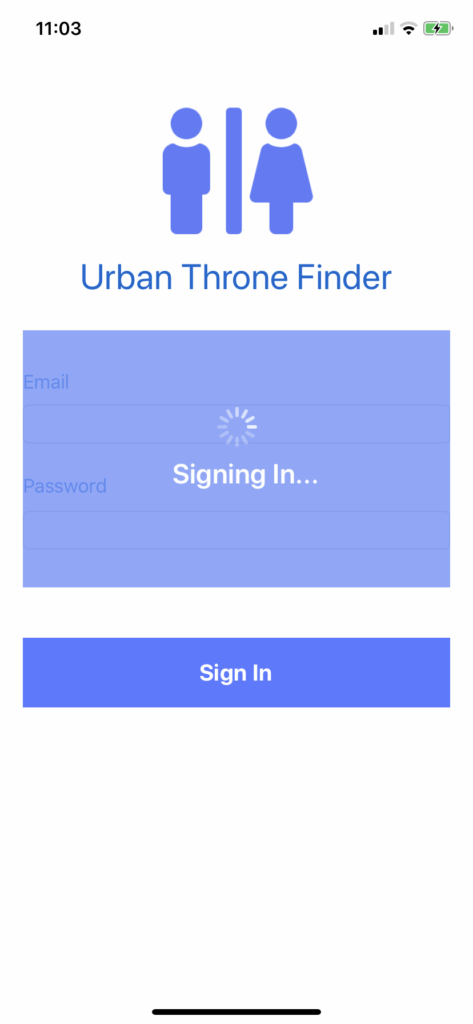
When an indeterminate progress indicator must prevent user interaction, it appears inside an overlay suspended over the rest of the interface or it simply replaces all other content of the screen, as in the App Store (pictured below).

Because the interface in this implementation pattern supplies VoiceOver with nothing else to read, focus should be sent immediately to the progress indicator. This can be achieved with the UIAccessibility.post(notification:argument:) method. Moving VoiceOver focus manually is not always (in fact, is rarely) a good idea, as the user should be one initiating actions within an interface. In this case, however, it correctly suggests to the user that there is nothing else of importance on the screen.
After the process is complete, VoiceOver focus should be politely returned to the natural focus state on the new screen. In the case of a new page load this is the top-left-most element on the screen (such as the screen title or a “Back” breadcrumb) whereas in the case of a partial screen refresh it may be helpful to move to the element that triggered the process in the first place.
If the process is going to take more than a second or two, or if it may be unclear what is occurring while the progress indicator is apparent, then supply the user with descriptive text, such as “Loading” or “Sending” in addition to the indicator so the user understands why he or she is waiting.
Parallel Indicators
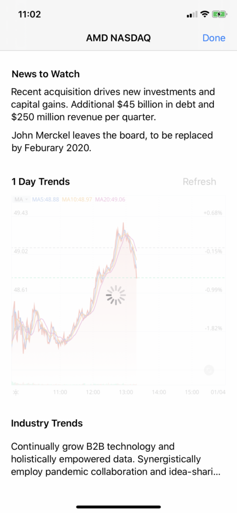
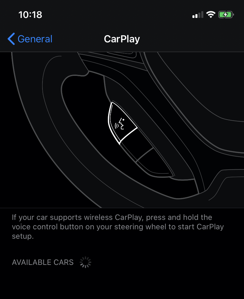
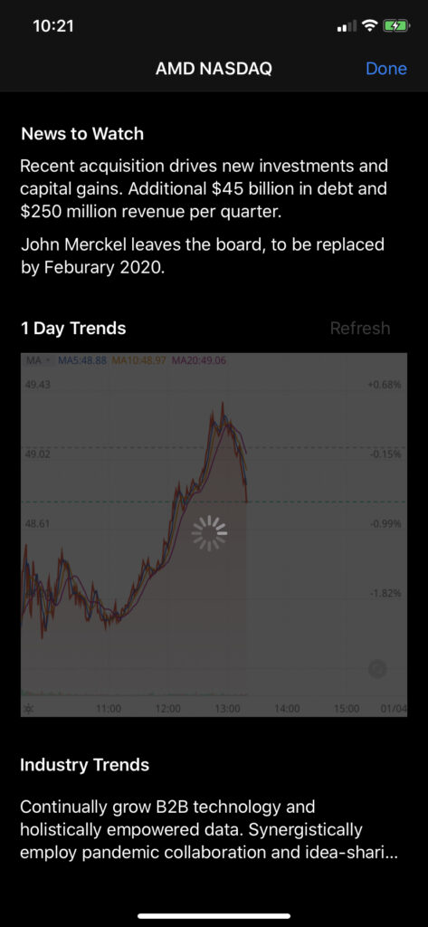
For processes that run silently in the background and do conflict with user action, an indeterminate progress indicator appears inline with other elements (as in the CarPlay screen below) or takes up a small portion of the screen (as in the card-style indicator below).
In this implementation pattern, the user is free to interact with the rest of the screen while she waits for the process to complete. Moving VoiceOver focus to the progress indicator, therefore, would be disruptive and it would require the user to find her way back to the initial focus. Instead, the presence of the progress indicator should be announced using the UIAccessibility.post(notification:argument:) method, just like an ARIA live region update. This confirms, in the case of a user-initiated process, that the system is working on the request. It may be helpful, as in the case of an obstructive indicator, to include a descriptive message in the VoiceOver announcement in order to clarify what process is occurring.
If the process is not user-initiated, as on the Wi-Fi screen (below) that immediately starts searching for available networks when the screen loads, then an announcement is unnecessary. The primary purpose of the announcement is for the system to confirm that a user request has been received. If the user did not make an explicit request, then a confirmation is superfluous.
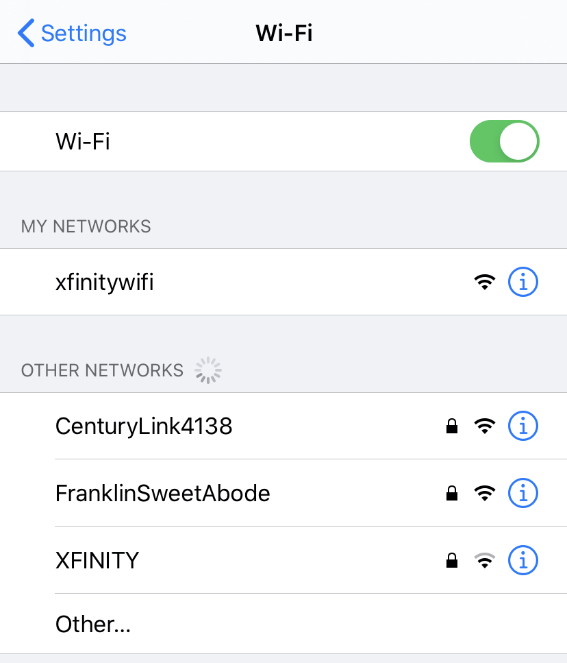
Furthermore, if the progress indicator is non-obstructive, it can be presumed that any data or functionality the user needs should already be available. For example, on the iOS Settings Wi-Fi screen, what is important to the user is not that the device is searching for networks, but rather the list of networks that are returned. It is likely that the user is looking for a familiar network, and those are usually returned first and before other networks are discovered. Therefore, though the indicator should be used to show the possibility of other options, this search is secondary to the list of familiar options that have already been served up.
Reduce Motion Setting
As mentioned in the previous article, there are users with visually-triggered vestibular disorders who may become nauseated while watching a spinning animation. Since there is nothing worse that your app literally making someone sick, Apple has provided a helpful feature: the Reduce Motion setting.
Using the isReduceMotionEnabled listener to halt animation is important but not sufficient. An activity indicator that is not spinning tells the user to wait, but it does not communicate anything else. Worse, the lack of motion may imply a lack of communication between the front and back-end of the system. What if the process has been disrupted? Since nothing is updating, there is no guarantee that anything is happening at all. What if the phone itself is frozen? What if the world has ended and nothing we do matters anymore, including refreshing that chart? What if your friends are being carried away by the rapture while you’re staring at your phone like an idiot?
Instead of simply stopping animation of the activity indicator when Reduce Motion is enabled, replace the activity indicator with a message, such as “Loading” or “In Progress”. After a couple seconds, if the process has not completed, follow up that message with an update: “Still loading.” This keeps the user in the loop and means he or she does not have to guess at whether the system is still working. Additionally, this may be an opportune time to apologize for the delay and explain its cause: “Sorry for the wait. We may be working on a slow connection. Not your fault though, our bad.”
(Note: If you are reading this on a phone, try enabling Reduce Motion (iOS) or Remove Animations (Android), or if on a desktop/laptop, Reduce Motion (macOS) or disable Show Animations in Windows (Windows). You will notice, on supported browsers, that the spinning graphic below is replaced by static text.)
Stalled Out
As a final note, there may be a case in which a process lasts longer than intended due to connectivity issues or system slowdown. In these cases, if an estimate cannot be provided on the length of the delay, then the system should resolve to an error message. Provide the user with instructions to resolve the cause of the delay and to restart the process.
Summary
- Indeterminate progress indicators do not provide the progress in percent or a time estimate of process completion; they should be used for delays lasting less than 10 seconds
- In UIKit, the
UIActivityIndicatorViewserves as the native indeterminate progress indicator - Decide whether to prevent user interaction with the indicator (obstructive) or to allow the user to interact in parallel to the process
- Obstructive indicators should replace all actionable elements on the screen or appear inside an overlay that takes over the screen; move VoiceOver focus to the obstructive indicator
- Parallel indicators may appear inline or take over a part of the screen such as a card; do not force VoiceOver focus to a parallel indicator, make an announcement instead
- Consider including a descriptive message with the indeterminate indicator to explain what is happening
- Listen for the Reduce Motion setting; if it is enabled, replace the activity indicator element with a text label that updates every couple seconds
Next article (Part 3 of 3) : Determinate progress indicators (progress bars)
Previous article (Part 1 of 3) : An Overview of Progress Indicators
Code Examples
iOS 13.4 – Swift 5 – Xcode 11.4
The best way to understand ideal behavior is to try it yourself. The repositories below contain some fun examples of obstructive and parallel type indeterminate indicators. I recommend running these on your iPhone or iPad with Reduce Motion disabled and enabled, and trying them with VoiceOver as well.
Obstructive Indeterminate Progress Indicator – GitHub repo
Parallel Indeterminate Progress Indicator – GitHub repo