Back in August the W3C WAI published a revised Working Draft of WCAG 2.2 for wide review. This is the second public working draft since February, and it introduces significant changes to the original recommendations. The intent of WCAG 2.2 is to continue the work of WCAG 2.1 by improving guidance for users with cognitive or learning disabilities, users of mobile devices, and users of e-books. Accessibility on mobile devices represents a major focus of this draft, as the WAI endeavors to keep pace with consumer technology.
W3C Specification Maturity Levels
Accessibility professionals are watching the WCAG 2.2 revisions with curiosity, because it appears that there will be no version 2.3. The Silver Community Group has been conducting research on the attitudes towards and usability of WCAG in preparation for its next major version, WCAG 3.0. The projected date for WCAG 3.0’s first public working draft is November, 2020. Check out the Silver Group’s usability research summary.
The Bureaucratic Process
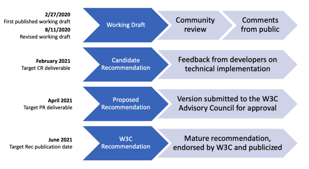
For those unfamiliar with the W3C’s process for proposing new guidelines and recommendations, there are four basic phases, and WCAG 2.2 is still in the first. In the Working Draft phase, the first form of a standard is made publicly available for review and comment from the community. WCAG 2.2 was made available initially on February 27, 2020, and the W3C released a revised working draft on August 11 with major updates. Next, a Candidate Recommendation (CR) is proposed. This draft collects feedback from developers on whether the standards require an unreasonable level of technical effort to implement. The CR date for WCAG 2.2 is February 2021. A Proposed Recommendation (PR) follows, which is simply the document submitted to the W3C Advisory council for approval; the committee expects this in April 2021. The final W3C Recommendation is endorsed by the W3C and publicized. The final recommendation for WCAG 2.2 is expected in June 2021.
I know the logistics aren’t exciting, but since there’s no Schoolhouse Rock video about it yet…this will just have to do.
Updated Success Criterion
In the August review draft, Success Criterion 2.4.7 Focus Visible is promoted from Level AA to Level A. This moves SC 2.4.7 into the group of the most basic and essential accessibility standards. Granted, private sector companies held to Level AA under the ADA will see no change in their obligations, but nevertheless the promotion is emblematic of this standard’s importance.
For keyboard users, a visible focus state is as vital and indispensable as the mouse cursor for mouse users. The working group did not justify the promotion of this criterion in the document, but none is needed.
New Success Criteria
Below are the success criteria making their debut or receiving significant updates in the August 11 working draft. I’ve included the text of each success criterion as well as some personal editorializing.
Level A
2.4.13 Fixed Reference Points
When a web page or set of web pages is an electronic publication with pagebreak locators, a mechanism is available to navigate to each locator and each locator maintains its place in the flow of content, even when the formatting or platform change.
WCAG 2.2 (2020)
Under this success criterion, ebooks are required to locate static page break locations from their print equivalents. This especially benefits students who would need to reference a printed page number or reference point within their electronic publication. When an electronic publication changes its orientation (portrait/landscape), enlarges its text, or is modified in other ways by the reader, this affects page number references relative to the original print publication. An ebook with text enlarged 200% can only fit about half the original content on each page; therefore if a professor references page 187, for example, a student’s adapted ebook might display the content on or near virtual page 374. Students should not be expected to do this math just to get to the right page.
3.2.6 Findable Help
For single page web applications or any set of web pages, if one of the following is available, then access to at least one option is included in the same relative order on each page:
- Human contact details;
- Human contact mechanism;
- Self-help option;
- A fully automated contact mechanism.
WCAG 2.2 (2020)
This guideline requires that all websites provide some way to ask questions of the site author. It may either be human contact details (phone number, email, hours of operation), a human contact mechanism (messaging, chat client, contact form, social media channel), a self-help option (FAQ, “How Do I” page, support page) or a fully automated contact mechanism (i.e., chat bot). For those who regularly slam their foreheads on the keyboard, this should give you an avenue to vent that stress.
3.3.7 Accessible Authentication
If an authentication process relies on a cognitive function test, at least one other method must also be available that does not rely on a cognitive function test.
WCAG 2.2 (2020)
An “authentication process” refers to an account login (or account registration) flow. This includes any method of validating your identity that requires you to pass an intellectual exam could potentially block some users from accessing critical account information. Examples of “cognitive function tests” are anything requiring memory (username, password, set of characters, images or patterns), data manipulation, transcription of information (audio to written), calculations or puzzle solving.
It is still reasonable for websites to require a username and password for authentication as long as the site does not block password manager plugins.
3.3.8 Redundant Entry
For steps in a process, information previously entered by or provided to the user that is required on subsequent steps is either:
- auto-populated, or
- available for the user to select.
Exception: When re-entering the information is essential.
WCAG 2.2 (2020)
This guideline should help users successfully navigate flows that have multiple steps requiring user input. Let’s say, for example, that you’re ordering a pallet of toilet paper to get you through winter. On the first step you you enter your credit card info and billing address. On the final step the website asks you for your shipping address, which for some is the same as our billing address. It would be frustrating to anyone to have to enter their entire address again, and for this scenario the success criterion requires that a web interface would either populate it automatically or present your address as a selectable option. (Note: This only applies for a single user session at a time, and not if the user closes the browser or navigates away and then returns.)
Level AA
2.4.11 Focus Appearance (Minimum)
For the keyboard focus indicator of each User Interface Component, all of the following are true:
Minimum area
The focus indication area is greater than or equal to a 1 CSS pixel border of the focused control, or has a thickness of at least 8 CSS pixels along the shortest side of the element.
Change of contrast
The color change for the focus indication area has a contrast ratio of at least 3:1 with the colors of the unfocused state.
Adjacent contrast
The focus indication area has a contrast ratio of at least 3:1 against all adjacent colors for the minimum area or greater, or has a thickness of at least 2 CSS pixels.
Unobscured
The item with focus is not entirely hidden by author-created content.
WCAG 2.2 (2020)
This success criterion appeared in the first public working draft as “Focus Visible (Enhanced),” and the revised draft makes the requirements much more straightforward. (I personally love describing this as “Minimum” rather than “Enhanced,” because anything ‘enhanced’ sounds like it’s a stretch to implement.)
The “Minimum area” requirement states that the focus indication area must be greater than or equal to the components circumference or greater than or equal to the shortest side multiplied by 8. The “Change of contrast” requirement states that the color change between default and focused must be noticeable, specifically at a 3:1 contrast ratio. The “Adjacent contrast” requirement states that the color of the focus area must contrast with all adjacent colors at 3:1. Or, and this is a really easy minimum, it must be at least 2px thick. “Adjacent colors” does include the component background itself as well as the containing page. The “Unobscured” requirement states that a focused element must be visible. For example, when an info button is focused it spawns a tooltip: this tooltip window must not cover, or obscure, the focused button.
2.5.7 Dragging
All functionality that uses a dragging movement for operation can be operated by a single pointer without dragging, unless dragging is essential.
WCAG 2.2 (2020)
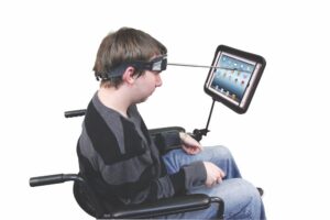
Dragging a slider (one example of a draggable component) requires a mouse user to click down, drag the cursor across a path, and then release. This involves two points of input: clicking and dragging. Some input devices, such as a head-wand, eye-gaze system or voice-controlled pointer system only permit a user to interact through a single point of contact. For these users, this guideline ensures that such components are keyboard accessible and can be controlled with single clicks or taps.
2.5.8 Pointer Target Spacing
For each target, there is an area with a width and height of at least 44 CSS pixels that includes it, and no other targets, except when:
Enlarge
A mechanism is available to change the CSS pixel size of each target, or its spacing, so there is an area with a width and height of at least 44 CSS pixels that includes it, and no other targets;
Inline
The target is in a sentence or block of text;
User agent
The size of the target is controlled by the user agent and is not modified by the author;
Essential
A particular presentation of the target is essential to the information being conveyed.
WCAG 2.2 (2020)
This one is a lot simpler than it looks: touch targets must have a width and height of at least 44px, with no overlap with other targets. This is in line with the 44pt touch target recommendation of the Human Interface Guidelines for iOS, as well as the 48dp recommendation of Android Material Design. This does not apply to unstyled native elements, only to custom components.
Please note the role that spacing plays in these calculations. If a target is only 20px wide and tall, for example, and separated from adjacent tappable elements by 12px on each side, then technically the target will pass these requirements. In other words, this success criterion is not as much about accurately hitting a sufficiently large target, as it is about avoiding the activation of other targets by mistake. Both aspects are a concern for users with tremors, arthritis or lack of dexterity.
3.2.7 Hidden Controls
Controls needed to progress or complete a process are visible at the time they are needed without requiring pointer hover or keyboard focus, or a mechanism is available to make them persistently visible.
WCAG 2.2 (2020)
People with memory impairments or cognitive disabilities may not be able to find controls if they are hidden until focused or hovered upon. A violation of this criterion is found frequently within native mobile apps. Have you ever used an email app every day, only to discover a year later that you can swipe to delete emails from your inbox? (…Me neither….) Since most email apps enable a user to delete a message from within the message, this has a secondary equivalent and is not a violation; but the principle is there. Don’t hide functionality from users in “clever” ways that will confuse users who aren’t power-users.
Level AAA
2.4.12 Focus Appearance (Enhanced)
For the keyboard focus indicator of each User Interface Component, all of the following are true:
Minimum area
The focus indication area is greater than or equal to a 2 CSS pixel solid border around the control.
Change of contrast
Color changes used to indicate focus have a contrast ratio of at least 4.5:1 with the colors changed from the unfocused control.
Unobscured
No part of the focus indicator is hidden by author-created content.
WCAG 2.2 (2020)
This is the stricter, Level AAA older brother of the previously-mentioned Focus Appearance (Minimum) success criterion. This requires that the minimum focus area be double the circumference of the focused control, that the color change from default to focus state contrast at 4.5:1 and that the focused item remains unobscured.
Further Resources
For more information on WCAG 2.2, check out What’s New in WCAG 2.2 Working Draft, provided by the Web Accessibility Initiative. For updates on the recommendation timeline, check out the Accessibility Guidelines Working Group (AG WG) Project Plan.