In the previous article on single-page applications I gave a background on how single-page apps work and how they differ from traditional multi-page applications. That article also outlined the challenges posed by single-page applications to users of assistive technology. In this article I will discuss strategies to address the following challenges:
- Navigation – focus management and page title updates
- UI Updates – not announced to the user by default
- Custom Elements – may lose free accessibility from semantic HTML
Navigation: The Debate
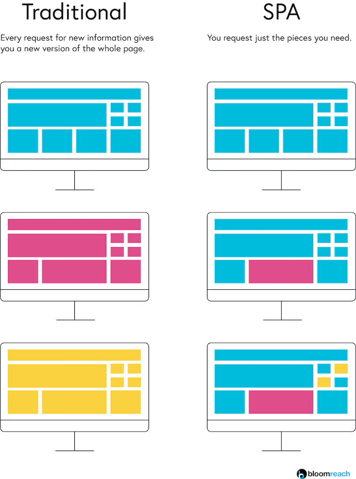
In a single-page app, when a user navigates from one page to another there is no need to refresh the page and re-render the new content. This is good for performance, but it represents a huge break from convention.
On a normal page refresh (in a multi-page application), focus lands at the top of the page; specifically, it lands on the first element in the DOM. Screen reader users and keyboard-reliant users both navigate web pages sequentially, so the initial focus location is very important for understanding the structure of the page and your current context. Additionally, on a normal page refresh the page title is updated to reflect the new content and this is the first announcement made by the screen reader, prior to announcing the first DOM element. This confirms for a screen reader user that they have navigated to where they intended, and it confirms that the navigation was successful and the new page has loaded.
There are two potential strategies for dealing with the problem of navigation in single-page apps.
Strategy A: Simulate a traditional page load
- Announce the page title
- Set focus to the top of the DOM
Strategy B: Work with what you’ve got
- Set focus to the main content
In Strategy A, you simulate a new page load–in other words, hold on to tradition by “faking” a regular page navigation. This involves using a live region to announce the updated page title (the text in the browser tab) and setting focus on the <body> element. This latter part would cause the default focus state to the the first element within the document body. Strategy B, on the other hand, takes an approach that is more natural to the SPA paradigm. Rather than making the application seem like a traditional multi-pager, you just make the single-page application more user-friendly. This means setting focus to where the user wants to go: the main content within the new page.
Strategy B wins out for a number of reasons. First, setting focus to the <body> of a page poses some problems. Some browsers will not permit focus to land there, and when it is permitted, NVDA starts reading the entire document from the top, which was quite annoying. We considered amending Strategy A to set focus to the skip link, which is typically the first focusable element, but that just didn’t make any sense. Why would you set focus to the skip link–if the user is going to skip past your navigation content to the main content of the page, then why not just set them there in the first place? Second, although some users appreciated the live region announcement, it had weaknesses. For example, a live region must be present in the DOM when an application first loads in order for it to make announcements later on; but in some cases the live region was being injected later in the application lifecycle, so it would not announce anything.
So, although Strategy B deviates from convention, it is a more intentional and reasonable approach to navigation strategy.
Navigation: The Solution
- Set focus to the <h1>
If the user has chosen to navigate to a particular webpage, then most likely it is because they want to see the main content of that webpage. Every page should have a single <h1> that introduces the topic of the page, so this is the perfect target for focus.
- Update the page title
The page title appears in the browser tab and is announced (traditionally) by screen readers on page load. The page title should consist of two parts: [page title] – [title of site]; for example, “Accessibility in SPAs – John Sweet’s Blog”. It is critical to ensure that the page title stays up to date and reflects the topic of the current page. The page title is useful for screen reader users as well as users with cognitive impairments to stay aware of their current context and their location within a website.
In a future article I will address specific implementation patterns for Angular, React and Vue. For now it is enough to mention that Angular offers a Title service that can handle updates to the page title.
- Indicate the current page in nav links
Because this approach to navigation may be unfamiliar, it is important that there are markers to tell the user what page they are on. Updating the page title is one way to do this; an additional method is to indicate the current page in the primary navigation. There is a design trend that involves underlining the currently active link, and this is helpful for sighted users, but like most CSS solutions it does nothing for screen reader users.
Ensure that screen reader users also have access to the indication of current page by including it programmatically. This may be done in one of two ways: either assign aria-current="page" to the link representing the current page or include offscreen text within the link that reads “current page”. Either of these approaches will have the result of announcing “current” page to screen reader users when they focus on the active link.
- Skip links should target the <h1>
This navigation strategy presents a clear benefit to sighted users who have a motor disability and cannot use a mouse. In multi-page app navigation, sending keyboard focus to the top of the document means that a keyboard user must Tab or arrow down to the main content of the page. In some cases, when there are a lot of navigation links and menus or other focusable elements, this requires a skip link so that a keyboard user can jump to the main content. With this navigation approach, however, each time the user navigates to a new page they have their focus set to the main content–no more need to Tab to the main part of the page!
A skip link may still be beneficial on the initial app load, when focus starts at the top of the document, or if a particular page is bookmarked or linked to. For these scenarios ensure that the skip link does target the <h1> so keyboard users can get down to business.
UI Updates
A single-page application can update parts of its interface, rather than having to re-render the entire page. This is extremely helpful because it provides the user with up-to-date information while conserving data transmission. The result is a web application that is more of a living, breathing organism than a traditional, static multi-page application.
Because an SPA can update its interface and data without a full page reload, there is by default no announcement or cue for a screen reader user that the interface may have changed. The change must be announced by the application dynamically, which requires either setting focus to the new content or making a live region announcement.
If the UI update is unexpected and critical to the user’s journey, then you should set focus to the new content. If, on the other hand, the update is expected and confirms the result of user interaction, then it is sufficient to make a live region announcement. For example, if you submit a form in which you have accidentally left a required field blank, then the form should return a message at the top of the form explaining the nature of the error and how to correct it. This UI update is unexpected and therefore the application should send focus to the message. As another example, if you add a product to your shopping cart and the badge displaying the number of items in your cart increments by 1, this is an expected change. It would be frustrating in this case for focus to be moved to the cart each time an item were added, so instead just announce the addition to the user with a live region.
Custom Elements
Single-page apps enable a modular approach to web development, which is extremely useful when building a large, complex application with many pages and reused user interface components. (“You built the perfect feedback form? Awesome, reuse it!”) Just as with the popular Atomic Design Methodology, the modular approach to development is appealing for large product development teams because it means products will have a more consistent look and feel, with a higher confidence in their quality, and all achieved with less effort.
In single-page apps developers can not only build reusable components, but they can also give them human-readable names. For instance, you could create a reusable element called <totally-awesome-button> if you wanted to. (But do you, though?)
Although these custom, reusable components make development more efficient, the approach also means that a single error can multiply to the magnitude of the number of places in which the component is used. If, for instance, you misspell an attribute in that <totally-awesome-button> tag, the bug will appear in every single instance of that button. There is an added danger to accessibility in these custom components: if the developer is not using semantic HTML5 markup, then the components may lack important features that are only noticed by assistive technology users. Unless a development team pays close attention and employs robust accessibility testing, then these custom elements may be inaccessible from the start.
As an example, if a <totally-awesome-button> were created using a <span> tag instead of a semantic HTML5 <button> tag, then the button would not be included in the focus order, it would not respond to Enter and Space key events, it would lack the “button” role announcement for screen reader users, and it would not be supported in high contrast mode. As another example, links that do not leverage the default properties of the <a> tag would come with all the problems listed for the custom button, and additionally they would not offer the helpful right-click context menu that permits users to open a link in a new tab.
Summary
The single-page application development approach poses significant dangers to users with disabilities — if developers are not familiar with the common pitfalls. Although there are no formal rules to guide accessibility in single-page apps, the strategies above should rid your application of any of the barriers posed by this new technology. Each Javascript framework, or flavor of single-page app, comes with its own tools and implementations of the strategies above. In future articles I will review these implementation patterns with code examples and sample applications for testing with your own assistive technologies.