Mouse users have come to expect a response when they hover over elements. Hovering may cause a hidden menu to appear, or a tooltip to explain the use of a tool, or it may simply change color as if to say, “That’s right, I’ll do a thing if you click on me.” These effects are called “hover states.” Similarly, when a user presses Tab on the keyboard and an element receives focus, that effect is called a “focus state.”
A visible focus state benefits anyone who is sighted and relies on the keyboard to navigate and operate an interface — or cannot rely on a mouse. A mouse is not an effective input method for people with limited dexterity or manual strength due to tremors, arthritis, Parkinson’s or any related nerve condition. The benefit of a keyboard is that it does not require fine pointing movements; a quiver of the hand does not cause a keyboard to miss its mark. Even a keyboard may require overly-complex actions for users who have had an arm amputated or who have a condition that prevents find motor control. Some people must use a switch device instead, or a sip-and-puff system, a head wand or some other form of simple manual manipulation.
Why Use a Custom Focus State?
Focus states are an absolutely necessary visual indicator that identify to sighted keyboard or switch users where on the screen is their point of interaction. This article will explore strategies and implementation patterns for custom focus styles. Even though our friendly browsers supply us with default focus states out of the box, we dare to be different. Plus, there are real downsides to the default styles.
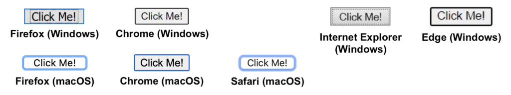
Some browsers use focus states that are invariably difficult to perceive (Internet Explorer), while others are visible only against light backgrounds (Firefox on Windows/macOS and Safari). Chrome employs a blue outline (black on Windows) with a white outline offset around it, which makes the blue stand out against a light background and the white stand out against a dark background. This is an adequate solution (albeit lacking that creative spark and UI appeal) — until you change the background color of the button to blue. Then the blue outline is subsumed into the blue background and appears to be just an extension of the button itself, if it appears at all.
These default browser focus states, when fashioned for elements with certain stylings, violate WCAG guidelines. The example above, a blue button on a white background with Chrome’s default focus state around it, is a violation of WCAG 2.2 Success Criterion 2.4.11 Focus Visible (Enhanced). In another example, a button of any color on a blue page background with Firefox’s or Safari’s default focus state, violate both SC 2.4.11 and SC 1.4.11 Non-Text Contrast (WCAG 2.1), because the user cannot visually differentiate the outline from the adjacent color of the page. (These success criteria are discussed thoroughly in my article, “Focus Visible is Evolving.”)
Adjacent Colors
Success criteria 1.4.11 and 2.4.11 both entail a 3:1 contrast ratio between the color of a focus outline and “adjacent colors.” Each success criterion, however, offers a different definition of “adjacent colors” that is in opposition with the other. SC 1.4.11 Non-Text Contrast calls for a 3:1 color contrast between (a) focus outline and (b) page background, but it explicitly does not mandate color contrast between (a) focus outline and (c) component background. In “Understanding Success Criterion 1.4.11: Non-Text Contrast”: “For user interface components ‘adjacent colors’ means the colors adjacent to the component. For example, if an input has a white internal background, dark border, and white external background the ‘adjacent color’ to the component would be the white external background.” SC 2.4.11 Focus Visible (Enhanced) calls for a contrast between (a) focus outline, (b) page background and (c) component background. In “Understanding Success Criterion 2.4.11: Focus Visible (Enhanced)”: “The requirement is to have an indicator that has a 3:1 contrast ratio with the adjacent colors (including the component) [emphasis added].”
To ignore contrast between a focus outline and the component to which it applies means that in some cases the focus outline will be imperceptible. Consider the buttons in the example below, taken from “Understanding Success Criterion 2.4.11: Focus Visible (Enhanced).” The button in the middle indicates that it is focused with a 2px black border, but the border is the same color as the component’s background. If the button did not have the two unfocused buttons next to it for comparison of scale, this focus state would be impossible to detect.
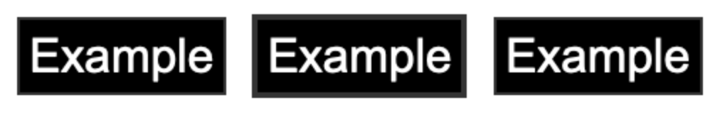
(Ironically this example is used in the article to illustrate how a 2px border can act as a visually salient focus state, but in my opinion it only exposes the weakness of any focus outline that is not a different color than, or offset from, the component itself.)
Focus State Patterns
Whether your website will use native button styles or specially-designed CTAs, you should use a custom focus style for your project. Whether you’re concerned about meeting WCAG compliance, or you just know deep down that your parents are still using Internet Explorer, a custom style is better than the browser native in almost any situation.
“Pretty Good” Strategy: Background Color Change
A popular option for indicating focus state is to change the background color of the focused element; this is primarily used on buttons and links. This pattern is frequently used on websites that want to grab your attention, because the change is visually emphatic and dramatic. Per my guidance in “Focus Visible is Evolving,” the focused background color should meet a 3:1 contrast ratio with the unfocused background color. In practice this strategy can certainly be visually appealing.
There is a downside to this approach caused by the phenomenon of human perception known as “change blindness.” What if the button about to be focused is on a totally different part of the screen than the last focused control, so you never notice the unfocused state? This problem harkens back to the example with the black buttons above. In the video below, focus starts on the ‘cart’ icon at the top-right of the page and the next Tab press jumps focus half-way down the page, past the fold, to the “Shop now” button. What you can’t immediately tell is that the “Shop now” button’s background color has changed; you can’t tell without having seen the original color.
This may not seem like a big deal, but there is a common practice in web design to use tall sections of content with a single CTA whose height prevents more than one CTA from being viewed at once. This is an especially common practice in WordPress designs, and as of writing, WordPress accounts for 37% of all websites. On the bright side, this technique is effective when the component receiving focus is surrounded by other focusable elements.
“Not Very Good” Strategy: Border
There is a multitude of implementation patterns that can produce a focus outline, and the “not good-est” of them is the CSS `border` property.
A natively styled gray button on a white background can make use of a `border` focus outline and work just fine (isn’t that nice). Outside of that narrow use case, however, this pattern loses its efficacy — just like the browser default focus states. When UI colors other than black/white/gray are employed, a focus border can be subsumed into the component’s background color or the background color of the webpage and disappear entirely.
The difficulty with the `border` approach is using a border color that contrasts both with the focused component and the adjacent page background. These requirements tend to necessitate a thick, bold border with a striking color that must be at odds with the color scheme of the UI in order to be noticed. Otherwise the border tends to disappear into the proverbial Simpson’s hedge of low contrast.
Furthermore, the participation of the border in an element’s box model mucks with the interface design. Because a `border` exists by definition between the padding and margin of an element, increasing the thickness of the border also increases the effective width and height of the element — causing the elements around it to shift. While the focus state might cause surrounding elements to shift only pixels at a time, this could be enough to push an element to the next line; either way, this result is best avoided.
“Best” Strategy: Offset Outline
Better than a `border` for creating a focus outline is the CSS `outline` property. On its own, the `outline` is separate from the box model, so its addition will not change the size or shape of the component.
Better yet, an outline may be “offset” from the focused component (see example below). Whereas a `border` touches both the focused component and the page background, an offset `outline` does not touch the component; this means that it is adjacent only to the page background and therefore need not contrast with the component as well. Not only does it circumvent the difficulty of adjacent colors’ contrast, but an offset focus outline is always apparent, even when you cannot see the element in its unfocused state.
The only downside to `outline` is UI-related, and it is petty. With a `border` (or `box-shadow`, to be discussed last), the border can be kept on just one side, like an underline, or on two or three sides; this allows for some degree of creative freedom. This is not so with an `outline`, however. It must appear around all four edges of a component. Furthermore, an `outline` cannot take on rounded corners; there is no `border-radius` equivalent for this state. In practice, however, these disadvantages are negligible.
“Seemingly Good But With Fatal Flaw” Strategy: Box-Shadow
Ever since the air was hard and the earth was soft, developers have asked, “How can I make an accessible focus state with all the must-have features of an `outline`, but without the creative limitations like its right-angles?” And the internet has screamed back: “Box shadow!”
The CSS property `box-shadow` can make up for the aesthetic disadvantages of an `outline`, such as an outline’s inability to round corners and put the outline on one side of the component. It is also capable of being “offset” just like an outline.

box-shadow: 0 0 0 3px #000;
box-shadow: 0 0 0 3px #fff,
    0 0 0 6px #000;
border-radius: 6px;
box-shadow: 0 0 0 3px #fff, 0 0 0 6px #000;
(Note: A box shadow interprets the radius of its corners from the shadowed component’s `border-radius` value. Therefore, if an element’s border is elliptical or rectangular, the box shadow must be as well.)
These virtues notwithstanding, the advantages of the `box-shadow` focus style belie a tragic flaw: box shadows are completely imperceptible in Windows High Contrast Mode. Oh yeah, remember High Contrast Mode? It is rarely included in manual accessibility testing, yet in “WebAIM’s Survey of Users with Low Vision #2 Results” more than 50% of users with low vision reported using some type of High Contrast Mode. Low vision users make up a large portion of disabled internet users, so this assistive technology should not be neglected.
(Note: This limitation impacts Windows only. Box shadow focus states remain visible in macOS Invert Colors mode.)
There are two workarounds for this tragic flaw, but one is inequitable and the other requires extra development work. One option is to add a “transparent” outline to the element on focus, in addition to the box shadow. This transparent outline will not ruin your painstakingly designed box-shadow pattern, because it only shows up when High Contrast Mode is enabled. The downside of this option is that the box-shadow focus state into which you poured so much creative ability, so many years of graphic design classes, will be lost for High Contrast users, making for an unequal experience.
Another option is to use the CSS `ms-high-contrast` media query to deign a focus state specifically for this demographic….Look, can we just agree that an `outline` is better already?
Summary
The best implementation pattern for a custom focus state is the CSS `outline` property with `outline-offset`. It is simple, easy to perceive even when you don’t see the change, it works in High Contrast Mode, and it requires no workarounds or special hacks. A `box-shadow` has the widest range of aesthetic design capabilities but it falls flat in Windows High Contrast Mode. A background color change is fine, and even positively appealing, but if the user cannot see the background color of the unfocused state then it is completely ineffective. The `border` property, although similar to `outline`, cannot be offset and is therefore hard to perceive against the component and the page background, and its participation in the box model means that it may “bump” the elements around it. The “offset” dimension of an `outline` circumvents the difficulty, posed by WCAG 2.2 SC 2.4.11, of contrasting effectively with both the component color and the page color. Although it may not possess all the aesthetic appeal of a box-shadow, an outline is the most robust and simplest approach to a custom focus state.